Founded in 2018 by Artur Schmal, Original Type has produced some of the most exciting retail and brand typefaces in recent years. Now, the Amsterdam-based foundry is joining Type Network’s global collection of partners. We sat down with Schmal to discuss his lengthy process, Victorian inspirations, and upcoming designs.
Lucas Czarnecki: If you can remember a specific moment, when and why did you get interested in type design?Artur Schmal: Since I was a young kid, drawing has been one of my favorite pastimes. I would go through my dad’s record collection and try to copy the lettering on the sleeves. Much later during my graphic design education my interest in typefaces began to shape, and later again when I enrolled in the KABK in The Hague I caught the type bug during Frank Blokland’s course in the first academy year.
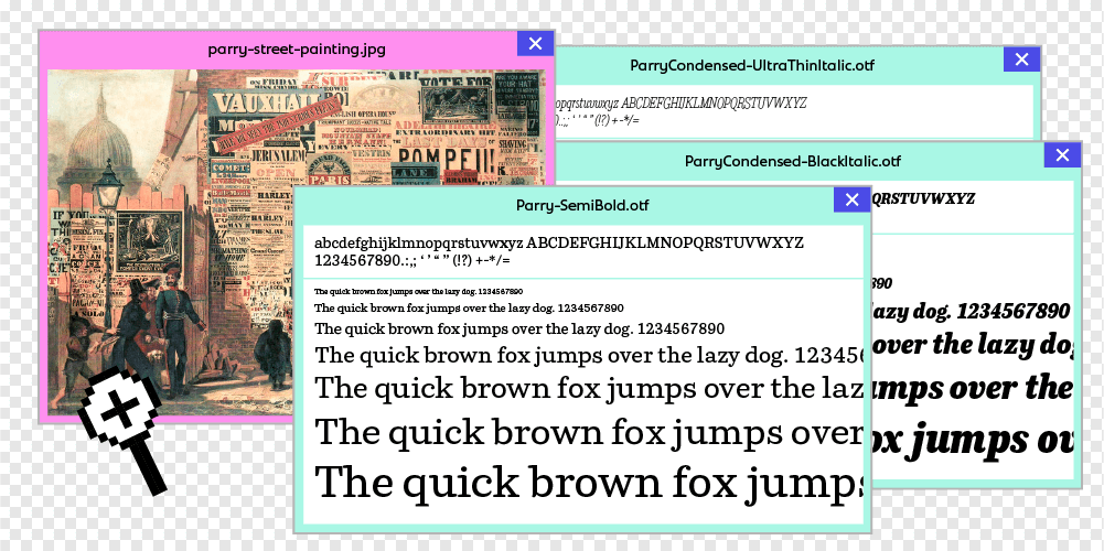
LC: What’s the story behind your first published typeface?AS: Parry evolved out of my graduation project of the Type and Media course in The Hague. The project existed of a rather unpolished type family containing slab serif and sans serif variants. I wanted to further investigate the idea of a slab serif family and a grotesque with matching weight and proportions in one family, but it needed a metamorphose to make it an actual useful tool for designers and typographers. That meant thinking of different purposes for the different weights. Regular and SemiBold weights for continuous reading, at the same time having slab serif impact qualities in the bolder weights.
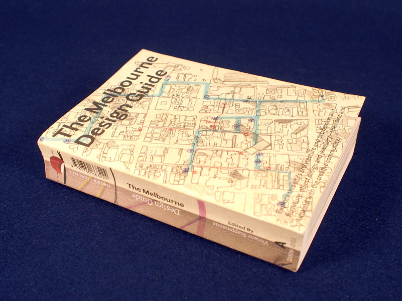
Parry and Parry Grotesque were used for the 2009 Melbourne Design Guide. Source: www.chaseandgalley.com License: All Rights Reserved.LC: How did you decide to start Original Type?AS: Before starting Original Type, my typefaces were published on the legendary, now defunct, OurType label. When they announced that they would cease activities I decided that I wanted to start publishing my designs through my own label.
LC: Is there anything unique or peculiar about your process for creating a typeface? If so, what?AS: I don’t think there is anything peculiar about my process, except that my process would take much longer than of most type designers. Honestly, my attitude towards the things I produce can be very ambivalent. What I’m excited about at the end of the day, I can be aversed by the next morning. It’s a process of working on and off on a design with inconsistent intervals of time in between.
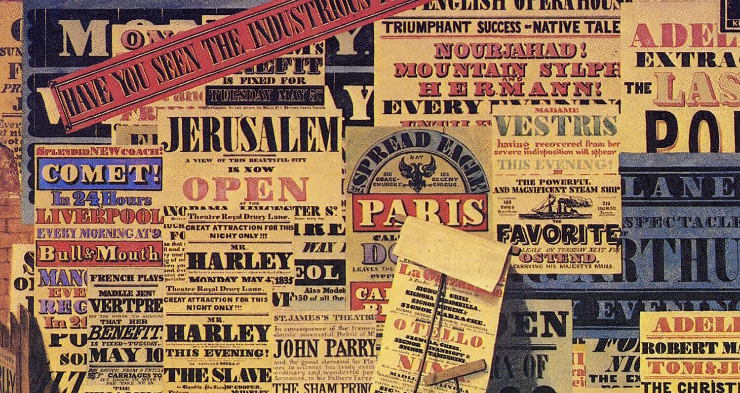
Parry gets its name from John Parry, whose painting A London Street Scene (1840) captures the typographic landscape of the Victorian Era. License: All Rights Reserved.LC: Where do you find your major sources of inspiration?AS: I find inspiration in several places. Years ago, when I was still practicing graphic design, I was using Futura in several projects. This was before the wave of new geometric sans serifs. I felt the need for a typeface in this genre but with some warmer personality. That’s when I made the initial sketches of what became Bonnie. But it can be just as well a small doodle of a lowercase a that sparks an idea for a new typeface.
LC: How do you balance practical needs with your artistic/inspired inclinations?AS: I guess balancing between client work and passion work is inherent to running a type design practice. For me, commissioned work is a way to gain resources that allow me spend time working on self-initiated type designs. It keeps things interesting actually, and sometimes client requests spark new ideas for retail designs as well.
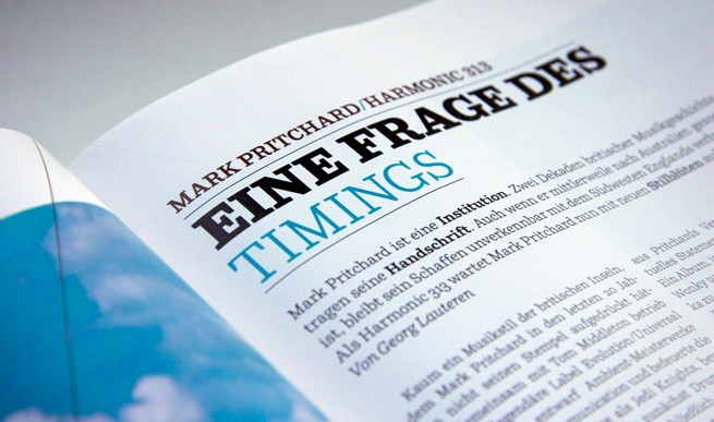
Parry used for De:Bug Magazine. Source: http://www.fontsinuse.com License: All Rights Reserved.LC: What is next for Original Type?AS: There are several new typefaces in the making. At least one of them should be released in 2022. Next to that, when starting Original Type it was not my intention making it a label for my own typefaces exclusively, I’d love to publish typefaces from other talented designers as well. Hopefully this will happen in the near future.
LC: What does it mean for you to be joining Type Network? Who among the foundry partners or staff are you most excited to work with?AS: Being given the opportunity to join Type Network means a lot to me. I have both the staff and the other foundry partners in high regard. The warm reception and guidance by the people at TN has been really great, and for one person foundry like me it’s great to receive feedback and help from the best in the industry.
Original Type joins TN with three excellent typefaces:
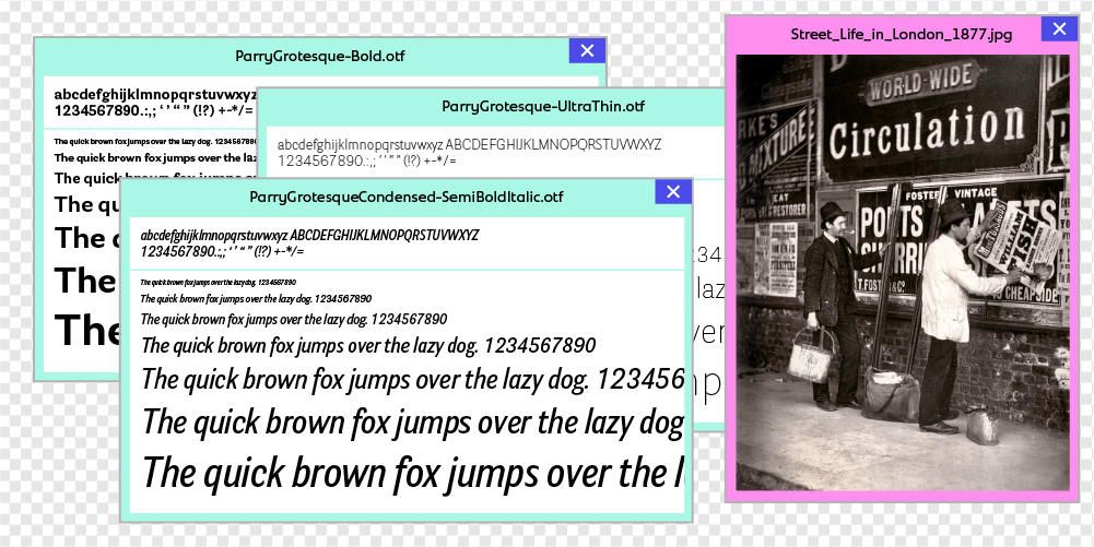
Parry
Parry has its roots in the robust slab serif typefaces that appeared in the Victorian age. It is not a revival though, and its aesthetics make it truly a contemporary typeface. The soft curves and quirky serifs combine with sharp cut stroke endings to produce a text image that is softer than the rigid nature of most slab serifs.
Resulting from the same Victorian era influence, Parry Grotesque is a comfortable and reliable choice for a wide range of applications. From corporate identities to book typography, from magazines to billboard-sized advertising campaigns.
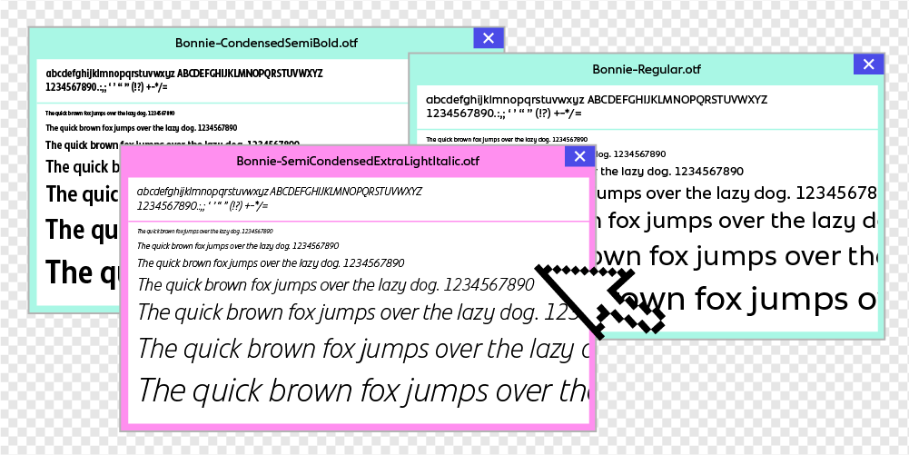
Bonnie combines the bold qualities of geometric typefaces with soft and human qualities that produce a friendly atmosphere. Coming in three widths, Bonnie is a great tool for copy fitting in a variety of layouts.
All Original Type fonts are available for print, web, applications, and ePub licensing. Webfonts may be tested free for thirty days; desktop trials are available upon request. To stay current on all things Original Type, subscribe to Type Network News, our email newsletter featuring font analysis, designer profiles, type and design events, and more.